I believe it’s of unique importance, and a core part of self-identity, to find a personal style: not from a trend, not from a magazine, but something curated and deeply personal. The office and the classroom are places which your own hand has no will to design – coming home to a home that’s personal and designed of your own free will, I believe, is core to establishing your identity. My design philosophy, or what I view to be aesthetically pleasing, pulls in different directions, and through my research for my upcoming Gallatin “colloquium” – more of a text-based review than the vigorous thesis defense I envisioned – I’ve been skimming through books about aesthetics, histories of design, and obviously, for intellectual dessert, the pretty homes I see on Pinterest and Zillow. Design, it turns out, is not such a soft subject as Architectural Digest catalogues will have you believe. It has economics, ethics, and ideology baked into every decision: what materials you source, what you preserve, what you tear down, and what you choose to live with.
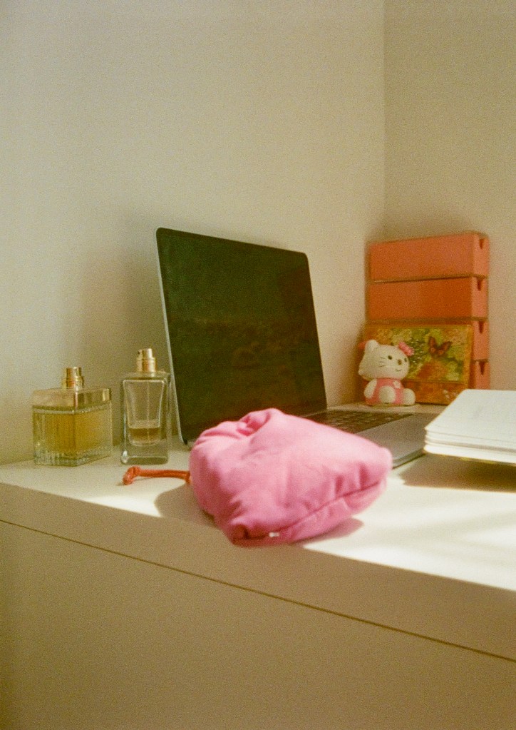

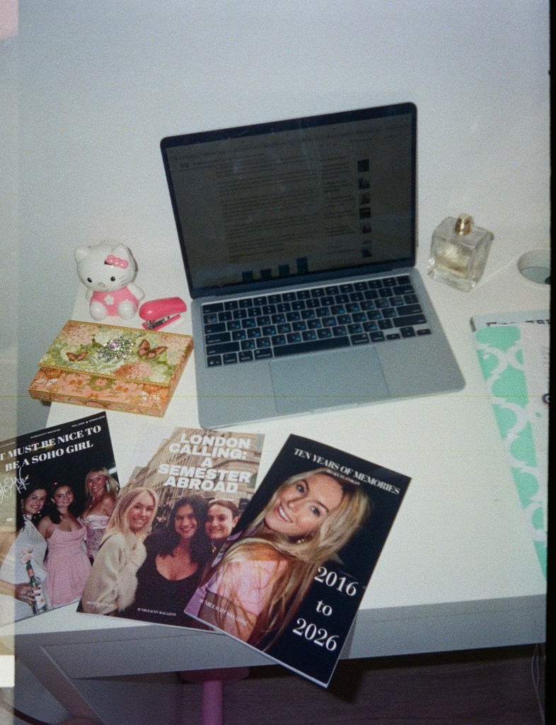
I’ve also come to believe it’s important to have a principled and logical top-down taste in design, something to be cultivated from an initial innate moment of aesthetic appreciation, a logic tree that delineates from a core statement, to a school of design, to individual items, which is why I’m trying to resolve my contradictions in my taste rather than picking and choosing, willy nilly, what looks good. In a house, it’s rather strange to have one room influenced by Lilly Pulitzer, and the next by 18th century Romanticism, just like in a head, it’s contradictory to be a “minimalist hoarder” or take on other oxymoronic self-descriptions.
What I’ve come to understand is that taste is not static. Some of what I loved at 17 now looks grossly garish to me. And Architectural Digest, once the canonical authority, now feels like proof of how quickly a taste-making institution can lose whimsy: minimalist interiors that are antithetical to how personal a home should be, curated by interior designers that went to one or two design schools that now dictate modern “taste,” losing history in favor of new and trendy and ultimately into the discard pile. Unfortunately, nothing less than an ultra-curated Pinterest feed really gets it right, not in a snobby way that signals superior taste, but in a disappointing manner that shows culture’s sway towards the singular importance of celebrities, who, in my opinion, are less worthwhile to listen for their opinions than the vagrant aspiring evangelist on the street corner that’s gone off his rocker.
I gravitate towards beachy and light aesthetics in my own interior design philosophy. Growing up near the water has made wide open horizons feel like a baseline requirement for happiness — translating into my predilection for large bay windows, white stucco exteriors, and the particular quality of light that bounces off pale walls in the afternoon. The modern obsession with dark grey “accents” to an existing modern home is dull: they make rooms feel smaller and heavier, which is precisely the opposite of what a home should do. Lilly Pulitzer’s tropical prints, which shock the viewer with their bright colors, are aggressively cheerful, force a change in mood – they insist on optimism. On a gray January morning in New York, a Lilly Pulitzer duvet cover set cheers me up, sets me on my way to class.


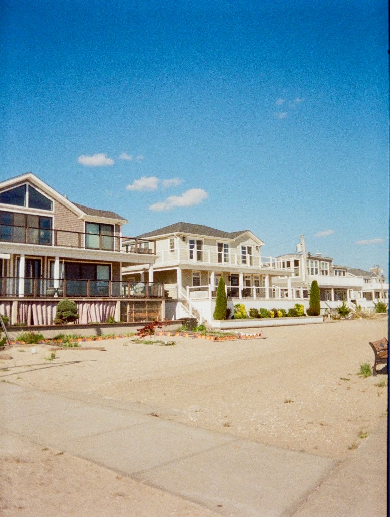

In terms of exterior, my favorite house in the world is Seashell House in Isla Mujeres, Mexico — white stucco curved into two seashells, a playful sculpture to live in. Let me use this as a case study for what I believe a home should be: a form of biophilic design, combining nature with man-made dwellings to be mentally uplifting and whimsical and unexpected. And furthermore, in the stucco exterior and open-door living, that’s the Mediterranean sensibility I keep returning to: the villas on the French Riviera, Amalfi coast, Florida homes based on that Mediterranean architecture. White stucco and aged brick are my two favorite exteriors.
Bathroom wallpaper is one place I’d break the white-wall rule – contained spaces can hold a stronger pattern (don’t conflate that with single-toned dark walls), and I love murals and hand-painted tile mosaics in a bathroom, something in the blue-and-white chinoiserie tradition I developed a fixation on through a British design course. The same logic applies to the kitchen: glazed mosaic tile backsplashes, copper fixtures with some patina to them, the small details that signal that a person lives here and has opinions. Bronze faucets shaped like sea creatures, copper mermaid door handles, a chandelier in the dining room with crystals and small candlesticks at even intervals are the specifics I find myself returning to.
Back to biophilic design. My mom’s garden was the earliest introduction: hydrangeas, roses, lily of the valley, daffodils, lilac bushes, a row of evergreens along the property line. Inside, golden pothos climbing vines, squat little succulents, and hibiscus trees grace our living room. Books, too, are one of my favorite items of decor, and useful, because I’ll consume a book like a piece of tiramisu, and also the wall of unread books reminds me to put away the credit card at McNally Jackson. More than half the rooms in my house have a bookshelf, each with a different theme – the paperbacks in my room are bright and colorful and host the more expensive editions of Kurt Vonnegut (I just love how his book covers use such bright colors–so ironic!) The sunroom on the second floor has got my yearbooks, as well as titles like War and Peace and the Secret History from a used bookstore – all crammed too close to the bookend-less shelf for my comfort.
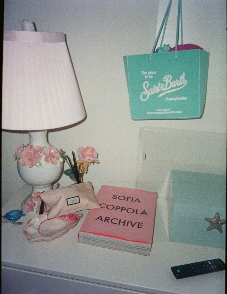
The part of my design philosophy that I haven’t fully resolved is between light, airy beachy aesthetic and my love of Romantic-era painting, the kind of rich, dark-framed canvases you find in the European wing of The MET, where I could spend an entire afternoon. A deeply saturated Eugene Delacroix painting doesn’t sit easily next to white-washed walls and rattan furniture. I haven’t reconciled this yet, and I need to figure out how to make this clash work. Maybe the answer lies in the notion that the best interiors look like they took years to curate. In one of my classes about adaptive reuse in architecture, we learned about pastische and patina – “bad” pastische in architecture is when a creator clumsily mimics another era, and while it’s hard to avoid without knowing the ins and outs of a historical design school, I disagree with the British scoffing attitude of “bad” patische, it’s miles better than living in a modern white box without personality. To combine optimism, bright colors, Mediterranean style, biophilic design, my beachy aesthetic, and my Romanticist taste in art is a tall order – but I know that my room, my taste in fashion, my future house, will be uniquely me and not dictated by a trend or haphazard juxtaposition, but the result of design study, an axiom that delineates into schools of design and down to particular objects. Maybe it will, in the end, be an appreciation of aesthetic beauty when all those items fall together in place – I do believe that the more my taste is curated, the more research I do, the likelier it’ll be that I’ll stumble upon a culmination of taste that supersedes terrestrial and temporal “design schools” and bridges my contradictory tastes.

 Sunbleacht